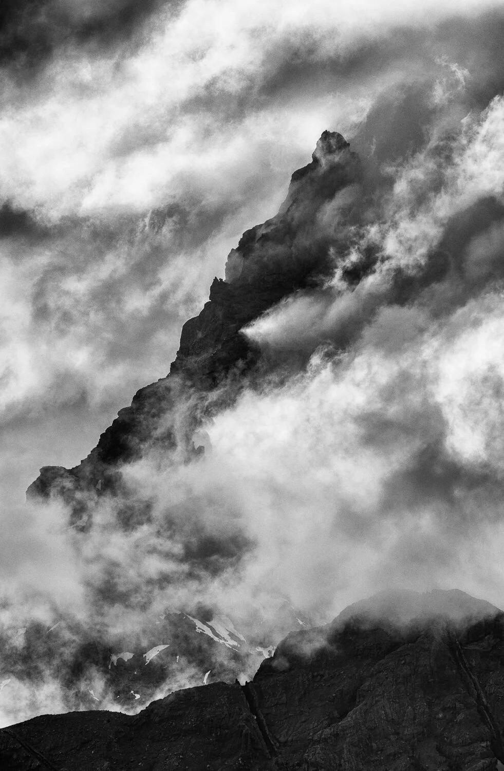
contrast in images is an interesting phenomenon. it can make an image feel harsh, it can make an image feel lush and soft, it can calm the viewers emotions or put them on edge. and it also makes an image “pop.”
increasing contrast is making the lighter portions of the image lighter and the darker portions of the image darker. decreasing contrast does the opposite and brings the lighter portions darker and darker portions lighter. notice, this is not the same as adjusting the white point and black points - that is taking the point that a pixel is pure white (no detail) and making it brighter or darker. (or pure black with no detail) contrast merely takes the darker or lighter areas and adjusts their luminance. (how light or dark they are)
i’m going to start with an example of contrast in both a color image and a black and white image. so first things first, this image of a waterfall in the indian peaks wilderness area in colorado has been processed as the best possible color image to represent how i saw it.

final color edit of waterfall in indian peaks wilderness
here’s the same image with a much stronger contrast

color edit of waterfall in indian peaks wilderness with much higher contrast - notice the rocks are much darker with some shadows now lacking definition and the water is a bit lighter - losing some of its definition
there comes a point with contrast, where it becomes too much. the darkness or lightness of the colors due to the increased contrast become unnatural looking in a color image. for me, that point is as shown in the image below, with the tone curve below it. notice how much darker the rocks are and the difference between the whites of the water and darkness of the rocks feels unnatural. also, the color has started to change in the red rocks.


yet, if we take that same image with that same tone curve for a high contrast image, and convert it to black and white in lightroom, we’re left with the image below. and that image does not look overly unnatural to my eyes.

black and white conversion of image above with high-contrast tone curve above, but feels more realistic and natural
as contrast increases in color images, the colors begin to morph into different colors rather than just lighter or darker versions of the color. at that point, leaves are no longer the color of a leaf we’ve ever seen, or in this case rocks no longer look like rocks we’ve seen. but black and white can handle those higher contrast scenarios because we don’t typically see in grayscale. every tone and luminance value is translated to a shade of gray, and since we don’t see in shades of gray, it doesn’t look unnatural. in essence, we have more liberty to increase contrasts in black and white images before being called out for “over processing” or “overcooking” our images.
now that we have some basics on what contrast is, how it effects images - both color and black and white, how do we get contrast into our images? there are three primary ways i get contrast into my images: contrast slider(s), tone curve(s) and color filters. i rarely ever use the contrast slider(s) in lightroom, although i will use both the amplify whites and blacks as well as the soft contrast in silver efx pro. (part of the nix collection and my primary conversion tool for black and whites) i prefer however using the tone curve(s) because i can better define which points in the luminance and color spectrums i want to fine tune the contrast. and finally, i absolutely love using color filters as a method of increasing (or decreasing) contrast where i want it. (or don’t want it) i’ll dig into color filters in my next blog post.