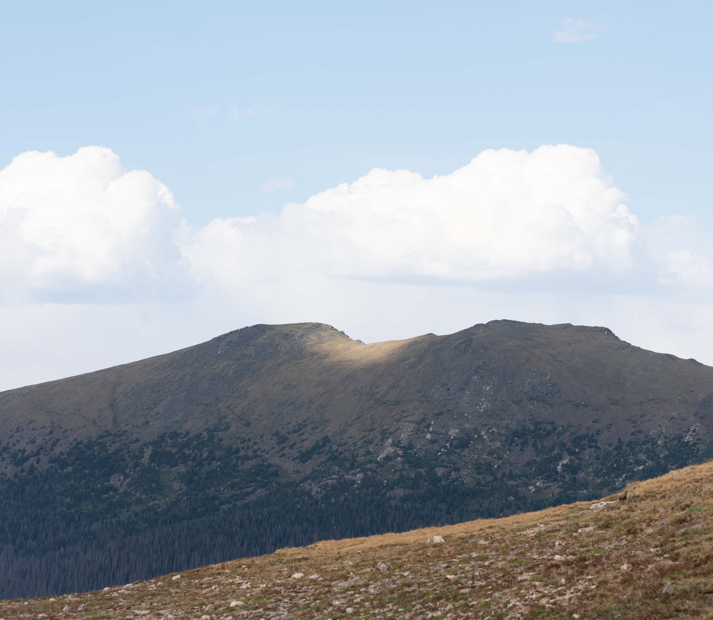
let’s continue our discussion on the photographic edit and our intent on invoking feeling from the previous post which can be found here: https://www.liftedspiritphotos.com/photography-blog/how-does-this-make-you-feel. i’ll explain my editing thoughts and steps using the following image, which i’ve named ‘spotlight’. this is the version with a crop applied (i’ll cover cropping in the future as it can be its own topic) to give what i consider the strongest composition, with no modifications other than turning on lens corrections and removing chromatic aberrations.

spotlight - initial version (only lens corrections, chromatic aberrations and a crop at this point
first I like to determine how i feel when looking at the image. then, i consider what i want the viewer to feel at the end of processing the image.
i begin with a question: what is it i feel while looking at the image?
there are a few things i love about the image: those soft, white clouds above the ridgeline and how they somewhat mimic the summits and saddle between the summits; the contrast of colors with that beautiful, soft blue sky vs. the darker green grasses in shadow; that strong diagonal of lighter grass in the foreground and that beautiful spotlight of sun on the saddle between the summits. so i have to ensure that no matter what or how i edit, i maintain those things.
and i begin with a question: what is it i feel while looking at the image? a sense of quiet and calm. there’s a softness to the landscape, which i find i’m often attracted to when photographing nature. so i want to maintain, or even enhance, those feelings of peace, warmth and quiet that i feel.
there are a number of controls at our disposal, but there are a few which i find can really make an impact on the feeling of the image. i recommend the book The Art of Photography by Bruce Barnhaum to get an idea of how different aspects of a photo and the processing you do can affect the final piece of art. if you haven’t dug into that book and find this content interesting, it’s an excellent way to begin a study of the language of the visual arts - which is the language we’re using to communicate.
don’t forget that localized edits can make a huge difference in an image, so don’t make all of your changes at the global level
now back to the controls i use to affect the feeling i want to invoke on the viewer: white balance - particularly color temperature, (modifying the tint slightly can also have an impact, but easily turns landscapes into garish pictures in my opinion) exposure, contrast, highlights and shadows, (less so, depending on the image) dehaze, clarity, saturation, vibrance and sharpening. that’s not to say the other controls don’t also impact the feeling of the viewer - much depends on the image. the important thing to remember is that you should play with all of the controls to see how they affect your feelings for each particular image. and don’t forget that localized edits can make a huge difference in an image, so don’t make all of your changes at the global level.
warmed up the lower portion of grasses up to the ridgeline
so, what will help us move towards our goal of increasing the peace, quiet and warmth in this image? let’s start with color temperature - it’s one of the biggest ways to impart a feeling in the viewer. the grasses in the foreground and middle ground in particular feel particularly cold as items in shadows often do. we can warm those up by taking the color temperature towards higher, more yellow/red values. (and vice versa if we want to increase the coolness, go towards lower blue values) go ahead and play with this value making it warmer and cooler and looking at your image while noting how the differences make you feel. in my case, if i do it at the global level, i’ll also affect the beautiful blue sky - which is one of the things i love about this image. rather than making a global adjustment, i’ll use a graduated filter starting at the bottom of the image towards the ridgeline as i don’t really care if it extends above the ridgeline a bit - the lower sky is closer to white and devoid of color. you can see this edit to the right of this paragraph.
the important thing to remember is that you should play with all of the controls to see how they affect your feelings for each particular image.

brought down the highlights of the sky, slightly cooled the sky and added a touch of clarity
one thing that i’m not fond of is the brightness of the clouds - you almost need sunglasses to view them and they lack detail in areas. in some respects that softness enhances the peaceful feeling, but the brightness contrasts just a bit too much. reeling the brightness in can have a big impact on the feeling of quiet while making the spotlight stand out even further. again, i could make the adjustment at the global level, but what would that do to the spotlight - one of the most important parts of the image? in order to maintain the spotlight, i’ll use another graduated filter - this time from the top of the image down to the ridgeline. in this filter, we’ll bring the highlights down until the clouds don’t necessarily pull our eyes from the spotlight. i usually don’t make big adjustments to large areas of shadow and highlight as you also lose dimension in the image - you have to make sure you don’t take it too far. one thing i like to do when editing, is look at a subject that’s not necessarily in the area i’m modifying and make the change to the slider - looking out of the corner of my eye to the area being edited. in this case, i’ll look at the spotlight, bring down the highlights of the sky to a point where my eyes no longer feel the immediate urge to move up to the clouds. i also just slightly cool off the upper portion of the image to further play up that color contrast between the beautiful blues and the greens/yellows in the grasses below. finally, i’ll add just a touch of clarity to give a bit more definition to the ripples in the clouds, but again ensure it’s not gone too far. i don’t want dramatic clouds as that won’t invoke the quiet, peacefulness i’m aiming for. you can see this edit to the left at the beginning of this paragraph.
when trying to evoke an emotion from the viewer, it’s important to compare how you feel after each change

global adjustments - slight decrease in exposure and contrast, increase shadows slightly, increase white point slightly while decreasing black point a bit, small increases in dehaze with even smaller increases in clarity and texture
at this point, i haven’t touched any of the global controls - everything has been localized to a particular area. the image histogram points to it being closer to overexposed than underexposed, but decreasing the exposure too much would remove the feeling of peacefulness we’re going for - the darker the overall image, the “darker” the feeling of the viewer. so i only slightly brought down the exposure. i also decreased the contrast slightly - the more contrast, the less “quiet” the image is and the more “in your face” and dramatic the image feels. i brought the shadows up slightly - decreasing the darker areas of the image decreases the feeling of darkness and dread. i also upped the white point slightly while decreasing the black point a bit. these controls do more than merely change the white point (the point in the image where white is pure white) - they change the tonality of the image. the more compressed tones (white point closer to the black point) give a certain feeling while less compressed (white point much further from the black point) give a different feeling. i’ll leave which causes which feeling(s) up to you as an experiment i recommend you perform. you should play with these controls at different values on a number of different images to see the effects of them on how the images make you feel. look at the overall tonality of the image when you’re adjusting these items - and ensure you don’t take them so far as to be clipping. finally, landscapes can sometimes appear foggy from atmospheric haze - particularly when photographing things at long distances. dehaze can often help clean that up, although some haze helps our end goal. the same goes for clarity and texture. i’ve very slightly increased each to a point i feel helps show off the image while keeping the feeling we’re hoping to attain. the one global adjustment group i’m saving for the next paragraph is saturation and vibrance. so the above image still has neutral saturation and vibrance.
slight increase in saturation
and finally vibrance and saturation…two controls that can kill the feeling of peaceful, quietness and solitude. i tend to keep modifications of these controls fairly small. on the left is an image where i’ve brought the overall saturation up slightly while still retaining a feeling of what i consider realistic colors - from 0 to +6. the image on the right side of the following paragraph has the saturation decreased slightly - from 0 to -1. the version on the left has a bit more “visual pop” as the color contrasts between the sky and the grasses offer a more visible contrast. that contrast is decreased ever so slightly on the image below with less saturation. the blues aren’t as deep, nor are the greens. but how does each make you feel - keeping in mind our goal is to create a feeling of peacefulness in nature? the increased saturation is causing a color imbalance with that richer blue that deters from the peace and quiet in the image. it also pulls my eyes ever so slightly from the primary subject of the image - the spotlight. i can tell this by looking at the spotlight and feeling the pull of my eyes up to the rich blues of the sky. that pull isn’t near as strong in the image in the following paragraph.
a number of small, subtle changes can play a big part in the emotional impact of an image

very minor decrease in saturation
now, compare the image that evokes a more quiet feeling in you to the previously posted image prior to the saturation modification. when trying to evoke an emotion from the viewer, it’s important to compare how you feel after each change - has the modification helped increase the feeling you want to evoke, or has it detracted from your goal? this is an incredibly important concept as each change you make impacts the changes we make further down the line. this is an interesting example because i feel the higher saturation image is overall, a more visually attractive image. however, the decreased saturation enhances the feelings of peace, quiet and solitude more to me. that may not be the case for you, but it is for me, so i’ll proceed with the lower saturation image. saturation and vibrance can make a difference between your image “talking in an indoor voice” (lower or perhaps even negative values) to “shouting” (higher positive values) at the viewer. i guess, in the end, i’m just more of an “inside voice” kinda guy.
there’s one more modification i’d make before moving the image to photoshop, (where i’ll fine tune some elements, remove dust spots and add some overall dimensionality) and that’s to add a bit of texture to the grasses in the foreground. this should help in our quest to achieve a bit of the dimensionality that we’re looking for. so i’ll add a graduated filter to bring the texture up only in the lighter grasses in the foreground. when we look at things in real life - we see more detail in the items closer to us, and less in the items a long way away. one way to get additional depth in this image is to make this first ridge have more detail, texture and depth. as is always the case - you can take the modification too far, so take steps to ensure you don’t make that depth too deep - drawing our eyes to it rather than the spotlight.

all modifications including the additional foreground texture

original image - before any modifications
compare the above images. the upper contains all of the changes we’ve made while the lower image is the cropped image with none of the adjustments. to my eyes, the bottom image is a bit “flat.” there’s more dimensionality in the upper image with the adjustments. it’s also a more calming image for me - in large part because the clouds aren’t so bright as to really contrast with the darks of the forest on the second mountain. there’s still a softness to the clouds while offering a lot more detail and dimension with the modifications. and if you lock your eyes on the spotlight in the middle of both images, you’ll likely find your eyes are drawn up to the bright clouds for the original whereas it’s easier to “lock on” to the spotlight with the adjustments. i feel the modified image is an overall better image, while enhancing the feelings of solitude, peacefulness and the quietness of the landscape. some may say the changes are subtle, and they are, but a number of small, subtle changes can play a big part in the emotional impact of an image.
that’s enough for this post. i’ll cover the steps i would take in photoshop to fine tune elements and hopefully continue down the path of evoking a bit more feeling from the viewer. one thing i didn’t discuss here, and i’m sure no one is actually reading any longer, but if you are - there’s a concept used in mixing music that i like to take when editing images. (i’ve brought a few concepts from music mixing to my processes on image creation) it’s said that one should rest their ears every half hour or so while working on mixing elements of a musical song. it allows our ears to recalibrate and gives them much needed rest when they’ve been working harder than normal. the same can be said for our eyes - especially since looking at screens isn’t particularly good for our eyes. so be sure to take occasional breaks and allow your eyes to return to normal. you may be surprised to find how differently you see your image (along with the modifications you’ve made) after taking some time away.