
in my last post, i discussed contrast in general, its purpose and my contrast preferences in photography. in this post, I’ll go over one of my two favorite ways to increase contrast other than the tone curve or the contrast slider. first things first, i’ll be discussing filters in this post, but not graduated filters, infrared filters or neutral density filters. i’m not talking about the filters you physically place on your camera, between your camera’s sensor and the object you’re photographing, but rather software implementations of color filters that are added while processing.
what is a color filter? a color filter lightens colors that match the color filter while darkening any complementary colors - colors opposite the filter color on the color wheel. what the heck does that mean? let’s say i’m using a red filter on my image. the reds in the image will now be lighter than without the filter. what about the complementary colors that are supposedly darkened? well, looking at a color wheel, we see green is opposite red on the color wheel - meaning greens will be darker when using a red filter. but notice also that red-orange and orange and red-violet and violet are close to red! so these colors also will be somewhat lightened with a red filter. and blue-green and blue and yellow-green and yellow are close to green! so these will be somewhat darkened with a red filter. apply the same concept to any other filter - yellow, green, blue or orange and you’ll see the colors that are lightened and the colors that will be darkened by your filter. (and if you don’t have a color wheel - now’s a good time and this is a good excuse to purchase one, or at least bookmark a good one online. color theory is your friend in photography and this color wheel will come into play in a number of other areas in your post processing journeys)
some of you may be wondering why on earth we’re talking about color filters when discussing black and white photography, and how on earth lightening some colors and darkening others has an effect on a black and white image. well, the masters of old black and white film used color filters when making their images. as a matter of fact, ansel adams’ son michael, said that ansel adams decided to become a professional photographer after switching his filter from yellow to red while photographing half dome. keep in mind it doesn’t matter if you’re shooting black and white film where the resulting image is in black and white, or color digital where you later convert the image to black and white - the concept is the same! the color of the filter, as seen by the black and white film, (or digital sensor) will be lighter and the complementary colors as seen by the black and white film (or digital sensor) will be darker.
let’s take a look at an example. below, you can see the original color image as well as the image as processed in black and white with no additional processing in nik collection silver efex pro. following those two images are the black and white images in the nik collection silver efex pro with the following filters applied at seventy-five percent: red, orange, yellow, green and blue

bears ears buttes - in color. notice the primary colors in this image: reds and oranges in the rock and supporting ground of the buttes, light greens and yellows in the grass and blue in the sky.

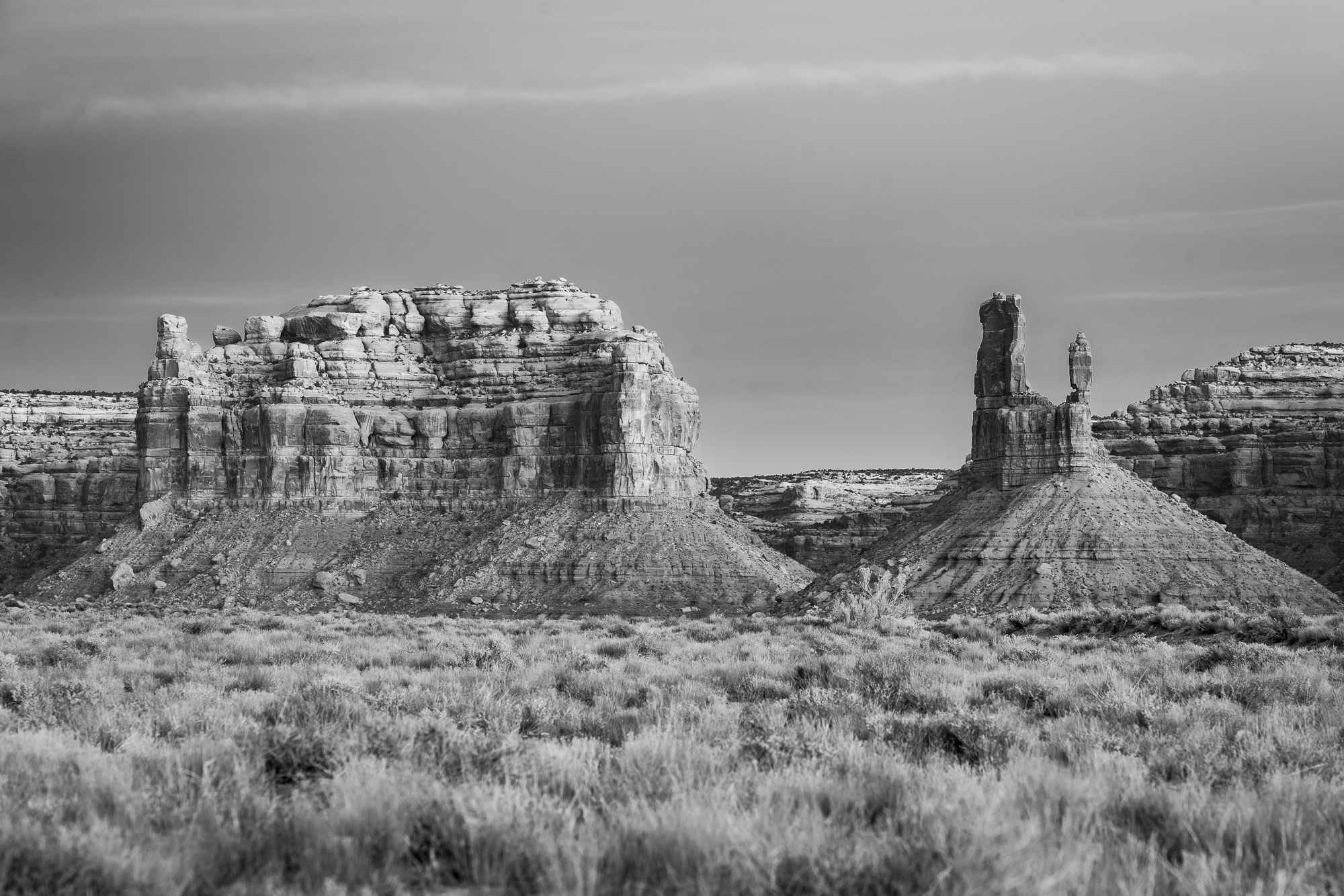
bears ears buttes - black and white, no filter. not really a very interesting image at this point.
bears ears buttes - red filter. notice the areas of reds are lighter, oranges and violets are somewhat lighter tones while the complementary colored areas of green are darker and yellows and blues are somewhat darker when compared to the non filter black and white image

bears ears buttes - orange filter. notice the areas of oranges are lighter, reds and yellows are somewhat lighter tones while the complementary colored areas of blue are darker and greens and violets are somewhat darker when compared to the non filter black and white image

bears ears buttes - yellow filter. notice the areas of yellows are lighter, oranges and greens are somewhat lighter tones while the complementary colored areas of violet are darker and reds and blues are somewhat darker when compared to the non filter black and white image

bears ears buttes - green filter. notice the areas of green are lighter, yellows and blues are somewhat lighter tones while the complementary colored areas of reds are darker and oranges and violets are somewhat darker when compared to the non filter black and white image (the grasses in this version are darker than the yellow filter because there’s actually more yellow in the grasses)

bears ears buttes - blue filter. notice the areas of blues are lighter, violets and greens are somewhat lighter tones while the complementary colored areas of orange are darker and reds and yellows are somewhat darker when compared to the non filter black and white image
which image above do you prefer? why? which shows the most contrast? is the image with the most contrast your favorite? i prefer the red filter - it provides a bit more contrast and the most natural look for me. the orange filter displays a bit more drama in the buttes with higher contrast but the shadows are too dark for my liking. the yellow is even more so dramatic and too dark in the shadows. the green filter darkens everything too much overall, actually lessening the contrast within the subject,
in general, i find the green filters are typically the most natural for the images i take, but i often prefer red, orange or yellow to some degree depending on the image. it may be the fact that blue skies are darkened with each of these filters which i tend to prefer. i rarely ever use the blue filter unless i’m really going for an artistic look for a particular image - it’s just not something that usually agrees with my images stylistically.
oftentimes, depending on the software you’re using to process your images, you can increase or decrease the percentage of the filter’s effect. in silver efex pro, i’m able to adjust the tone of the color being filtered as well as the percentage of the filter applied, and i can use both those settings to fine tune the filter and the contrast i’m looking to achieve. make your filter choice based on the subject(s) in your image you’re trying to make pop. try numerous filters to see which gives you the best image. don’t be afraid to mix and match with layers in something like photoshop or capture one.
while i can’t go into detail about each piece of software out there to provide ways to use filters in your black and white images, i will delve into those i’m most familiar with: silver efex pro from the nik collection and photoshop. it is possible to produce filter-like images with lightroom using the color sliders after converting to black and white - but adjustment of the color sliders is something i’ll discuss in the next blog post.
in silver efex pro, there’s a “color filter” section - the third item down in the adjustment panel. it has a number of colored circles as well as hue and strength in the details portion. the first circle is no filter, the next is red, next is orange, next is yellow, next is green and the final is blue for those that aren’t the best at seeing colors. don’t forget to modify the hue and strength to fine tune your filter!
in photoshop there are probably about a thousand ways to do anything, but the way i’ve used the filters is add a photo filter layer, then select the layer you want: red, orange, yellow, green, cyan, blue, violet, etc. you also have the option to select your color outright in the color picker. you can add multiple photo filter layers if you want or warming filters or cooling filters. then add a black and white layer on top of that, go back and fine tune your photo filter layers. experiment with preserving luminosity or not to get the final image contrast you’re looking for.
finally, some things to keep in mind when using color filters on black and white conversions. first, the color filters won’t improve contrast if your image is already lacking in color or converted to black and white. this is only going to work when you start out with a color image and an image that has a decent amount of colors and complementary colors. (opposites on the color wheel) second, look for the areas you want to stand out in your image, and determine the colors of your subject and immediately surrounding it. if your subject is the yellow light of the sun on a mountain surrounded by a blue sky - you likely want a yellow or blue filter. choose your filter so that it enhances your subject(s), not the rest of your image. by increasing contrast and darkening areas that weren’t previously darkened - you may find your sensor needs cleaning, and that you missed some sensor dust spots once you’ve added the filter. be sure to go through your image zoomed in, once again looking for sensor dust spots or dust. finally, and related to that, you may now find areas where your processing is a bit too precise and needs to be feathered, so look for that as well. if you discover it, it’s best to just go back to the color image and modify it there and get it right rather than trying with the black and white image. i’m speaking from experience. ;)